
Episode Transcript: How Macmillan Audio Designs Their Sci-Fi and Fantasy Audiobook Covers
This is a transcript for our episode How Macmillan Audio Designs Their Sci-Fi and Fantasy Audiobook Covers
Hey everyone! This is a follow up to our last mini episode on audiobook cover design, so if you haven’t listened to that yet, definitely check it out before listening to this ep. I wanted to share an update with additional information because the lovely folks at MacMillan Audio got back to me with two fascinating audiobook cover design case studies. Design Manager Abigail Starr put together examples of recent fantasy audiobooks for which her team didn’t directly adapt a print cover.
Let’s look directly at the case studies first, then talk about how this may fit into my larger theories about audiobook cover design difficulties.
Macmillan Audio Cover Examples
The first example is a series, The Wizard Knight duology by Gene Wolfe. MacMillan cited two main reasons that they didn’t use the print edition cover –
1. They weren’t able to recover the paperwork for the hardcover imprint’s cover design, an illustration by Greg Manchess from the first published edition by Tor Books. Since they weren’t able to verify the contract details, it was best to go in another direction.
2. They felt that the original cover would be less than ideal as a smaller digital version – the images and icons wouldn’t translate well.
As a solution, they broke down the cover into elements and moved forward with the ones that made the most sense, both visually and copyright-wise. MacMillan was able to license the beautiful, flowing lettering from the original cover, created by Iskra Johnson. They also created border elements that are visually similar to the illustration borders from the original covers. By paring down the covers to highlight the lettering, they not only make the covers more suitable for viewing on phone screens, but also create a tie between the print edition and audiobook edition with the recognizable font and the similar borders. They also used a color scheme for each that harkens back to the print editions. With the simplified layout, they also had room to include a review quote on each – one of which is particularly galvanizing (“If you don’t read this book you will have missed out on something important and wonderful,” from our friend Neil Gaiman).
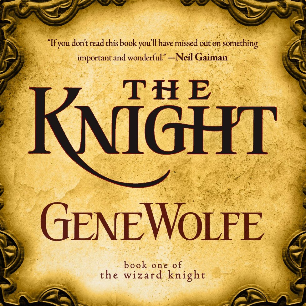
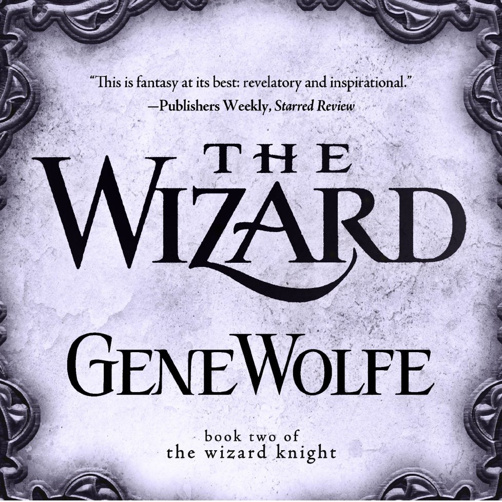
I think both of these covers are pretty perfect – they’re clean but visually appealing, they have recognizable cues connecting them to the print covers, and the overall style feels consistent with the medieval, high fantasy setting.
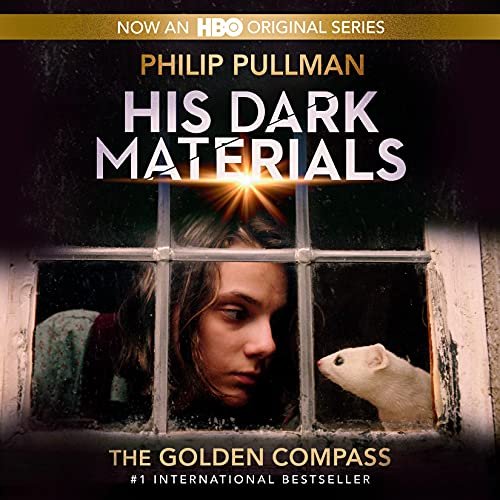
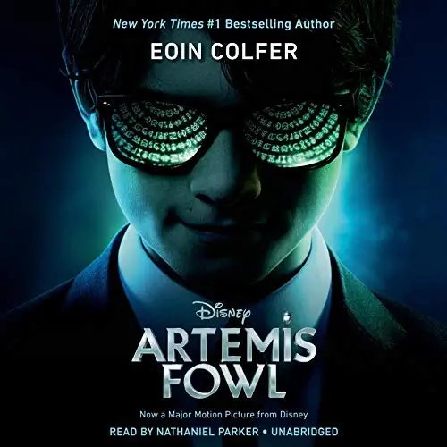
The second example is one I’m sure you’re all familiar with – Dune, by Frank Herbert. I found this to be a particularly compelling example because I touched on the less-than-ideal film poster-inspired covers for Artemis Fowl and The Golden Compass in our previous episode (both by Listening Library, an imprint of Penguin Random House. That’s right, I’m gently calling out Penguin Random House and no publisher will ever share anything with me ever again).
For Dune, the publishing rights for the audio, print, and eBook versions are all separate and held by different publishers – likely because this is a massively popular work and I imagine these licensing fees are pretty hefty.
I have to interrupt myself here to share that while I was researching Dune publishing rights, I found a piece on Esquire about an anonymous NFT crypto group called Spice DAO thinking that they bought the rights to the book Jodorowsky’s Dune, about the director Alexander Jodorowsky’s infamous 1974-1976 attempt to adapt the book into a 14-hour-long movie starring Salvador Dali, Orson Welles and Mick Jagger (in an unspecified role). The book in question is a collection of concept art that was created for studio executives at the beginning of the production process, and there were very few copies made. Copies of the book come up at fancypants auctions from time to time and typically sell around $25,000. Spice DAO thought they were making chumps out of the other Dune chasers and bid $3 million in crowdfunded money for a copy in November 2021 - likely to coincide with the most recent film’s release – and won.
They planned to use it to create “a collection of NFTs that are technically innovative and culturally disruptive” and specifically said that they would burn the book, record the burning, and sell the video as an NFT (Editor’s note - all of this during a global pandemic as social structures crumble around us). Only after they bragged about their purchase on Twitter did Spice DAO realize that they had not, in fact, purchased the book’s copyright, but rather a single, absurdly expensive copy that they bid up themselves. They’re also likely not even allowed to burn the book because there are so few copies that this would constitute destruction of historic property. All in all, an incredible and embarrassing copyright catastrophe.

Back to the Dune audiobook! MacMillan only publishes the audio edition, so their art department wasn’t able to work with the book’s art team, although the print publisher did share a studio contact so that they could gain access to art created for the film’s marketing materials. MacMillan came to separate agreements with the production studios involved, and went with a layout inspired by one of the film’s posters. This is a film adaptation-inspired cover that I’m really into – it features the full cast laid out in a sort of Cool Guy Pose pyramid, and uses the space vibe font of the film’s title. This is more a testament to Dune’s outrageously good casting than anything else, but when you have the opportunity to get people to read a book using the likenesses of Timmee Chalamet, Oscar Isaac, Javier Barden, Jason Momoa and Zendaya, you take it.
Comparing it to some of the other film adaptation-focused covers mentioned in my last episode (Golden Compass and Artemis Fowl), I do think that some of the strength comes from it being a book targeting adults rather than young readers. Using this type of actor-oriented art isn’t going to have the same resonance for kids’ media because they typically care less about featured players. Also, we have more to work with with 2021’s Dune than we do with either the HBO His Dark Materials series or Disney’s Artemis Fowl adaptation, in terms of quality and potential art. I haven’t watched either of the others out of sheer anxiety, but the Golden Compass cover is unsurprisingly the stronger of the two, featuring Lyra and Pan in a quiet moment. The Artemis Fowl adaptation – currently boasting an 8% on Rotten Tomatoes – has a hoping-to-be-badass sunglassed Artemis with runes reflected in his sunglasses in a clear Matrix ripoff.
They also shared an earlier version of the audiobook cover from prior to the most recent film adaptation’s release. This also has a different cover from the print edition because of the same licensing issues – they have access to the audiobook rights only. This audiobook cover was designed in 2007 and went for a kitsch-soaked scarlet and gold sand dune backdrop, with rays of identical UFO-styled spaceships filling the red sky.

This isn’t my favorite cover but I do think it playfully encapsulates some of the book’s themes while also keeping it much simpler than many older Dune covers featuring rearing sand worms, outrageous outfits and pulpy action sequences.
Getting this breakdown is so valuable because we get a peek into just how much is involved in the creation of a quality audiobook cover. I largely lambasted the audiobook publisher Recorded Books LLC and one of their imprints, Tantor Audio, in my first episode about audiobook cover design. MacMillan is a storied publishing house (one of the Big 5 publishers!) with a range of imprints and a dedicated audiobook department. Their process looks different from what I expect the publishers I investigated in the previous episode are able to do in terms of budget, contacts, internal resources and capability. It’s hard to compare their work to Recorded Books LLC’s because it’s just so superior – and I’m not just saying that because they were kind enough to put together a packet for me! But considering all of the moving parts, staff, communication, licensing – not to mention creative skill and ingenuity – involved in designing audiobook covers makes it clear why there are so many shoddy ones filling Audible’s sci fi and fantasy sections.
I still feel there’s a case to make for these less-resourced and established audiobook publishers to put more effort into their covers. Throughout this research process, my belief that the sole visual link to the material is a crucial piece of communicating an audiobook’s contents to listeners has only been reinforced. But when you’re doing your best to churn through what must be an absolute glut of material, I understand why you might take on a night-before-finals mentality and end up turning to crude computerized mush mouths with floating swords against pixelated skies. I hope that there’s a future ahead of us where, as audiobooks become more and more popular, their art is able to rise to the occasion – and given the respect it deserves by all audiobook publishers.
Many thanks to Drew and Abigail with MacMillan audio for their assistance and insights! Please let me know if you’ve enjoyed these investigative episodes – I’m interested in doing more if you’re interested in listening. Take care, and we’ll be back with our next episode on The Changeling Sea by Patricia A. McKillip soon!